PowerPoint design rules for educators
With the risk of sounding like the gun lobby, there’s nothing wrong with PowerPoint, only PowerPoint users.
Like it or not, we’re in the communications business and our audiences know what good comunication looks and sounds like. Here are my rules for slide design.
It is not lesson planning software
Use PowerPoint for its designed purpose: presenting content to an audience.
Too often you see presentations where slides serve no purpose other than to remind the presenter what they’re talking about. Even worse are slides used as a tele-prompter for the presenter to read verbatim.
A presentation is a combination of written words, spoken words and images. If the point is made using one of these, you don’t usually need to use one of the others.
Develop a system – stick to it
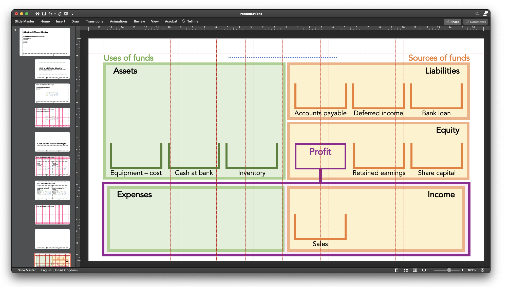
PowerPoint comes loaded with default slides: layouts, fonts, headings and footers. Most educators use these defaults for years without changing so much as font type or size. Change the default layouts by editing the Slide Master. This is not difficult and once done, you can apply it to all your presentations.
Choose a few simple layouts and a couple of suitable fonts: have one font for headings and one for content, but no more than that, unless you’re a graphic designer. Use an appropriate font size for the presentation environment. It’s difficult to be prescriptive about font size, but remember that some students will be using their mobiles to access materials.

Keep it clean – get rid of junk
Style is a matter of taste (sort of), but even so we tend to agree on good design when we see it. The Apple brand comes to mind.
We’re not all designers and we may not have the time or inclination to worry about pixels, line justifiying and colour matching. So keep things simple.
Use images sparingly, appropriately, and carefully
Slides do not need to be decorated. They need to carry meaning. Just because an image is available doesn’t mean you have to use it. Think carefully about the meaning you are trying to convey.
If you do use an image, give credit where it’s due. We are very clear with students about maintaining high standards of academic conduct and avoiding plagiarism, so model good behaviour in your own materials.
Read, review – read and review again
I get bored correcting the same mistakes that students make – silly typo’s, missing commers; inaccuarte punctuation. You get the picture. But measure your own work by the the standards that you set your students.
We commonly tell our students to read through their work before submitting. I advise mine to read written work out aloud or even better ask a member of the family or a willing friend to read it for them.
Do the same with your own presentations.
A few tricks
- Amend the “Notes” master so it works as a handout for students. This keeps your handout with your presentation. If you amend the content, you can amend the handout at the same time.
- Narrate a slide. This way your students can hear you present each slide. It’s no substitute for a live or online lecture but makes for a rather fancy handout. Unlike event recordings, you can change the slide order and the sequence of your recordings are also changed.
- If you use the same slide time and time again, add it to your “masters”, then insert that slide from the “insert new slide” command.
© AccountingCafe.org
Recommended resources
Duarte is a consultancy and design agency that supports major companies with presentations for leaders and brands. They have excellent free guides and resources on their website to help you improve the effectiveness of your presentations.
SquarePlanet also has great free content. Look for their free eGuide: Code of Content.


I enjoyed this post Tony – there’s some great tips here. One of my greatest learnings associated with Powerpoint was in a pitch to secure a significant piece of consulting work. We were the last on (10th or so) so the client team were visibly tired. We had a gorgeous slide deck – so clever – we had to win. As we stepped up to start, the data projector died and could not be resuscitated. We turned the lights up, faced the client team and said “We’re sure you’ve seen and heard some impressive presentations today. What would you like to talk about?” The whole mood changed and an energised conversation ensued. [ps. we got the job]